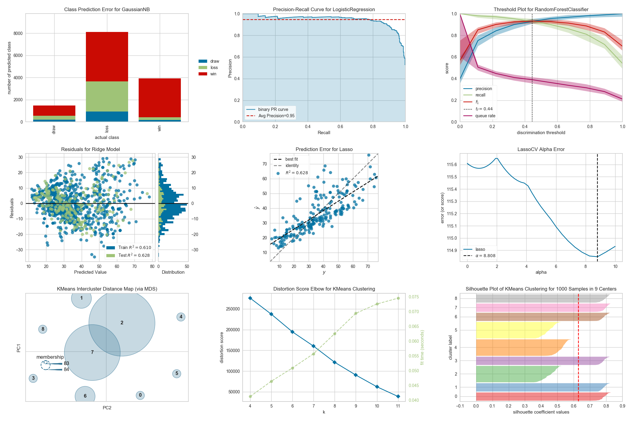
Feature Visualization
- Rank Features: pairwise ranking of features to detect relationships
- Parallel Coordinates: horizontal visualization of instances
- Radial Visualization: separation of instances around a circular plot
- PCA Projection: projection of instances based on principal components
- Manifold Visualization: high dimensional visualization with manifold learning
- Joint Plots: direct data visualization with feature selection
Classification Visualization
- Class Prediction Error: shows error and support in classification
- Classification Report: visual representation of precision, recall, and F1
- ROC/AUC Curves: receiver operator characteristics and area under the curve
- Precision-Recall Curves: precision vs recall for different probability thresholds
- Confusion Matrices: visual description of class decision making
- Discrimination Threshold: find a threshold that best separates binary classes
Regression Visualization
- Prediction Error Plot: find model breakdowns along the domain of the target
- Residuals Plot: show the difference in residuals of training and test data
- Alpha Selection: show how the choice of alpha influences regularization
- Cook’s Distance: show the influence of instances on linear regression
Clustering Visualization
- K-Elbow Plot: select k using the elbow method and various metrics
- Silhouette Plot: select k by visualizing silhouette coefficient values
- Intercluster Distance Maps: show relative distance and size/importance of clusters
Model Selection Visualization
- Validation Curve: tune a model with respect to a single hyperparameter
- Learning Curve: show if a model might benefit from more data or less complexity
- Feature Importances: rank features by importance or linear coefficients for a specific model
- Recursive Feature Elimination: find the best subset of features based on importance
Target Visualization
- Balanced Binning Reference: generate a histogram with vertical lines showing the recommended value point to bin the data into evenly distributed bins
- Class Balance: see how the distribution of classes affects the model
- Feature Correlation: display the correlation between features and dependent variables
Text Visualization
- Term Frequency: visualize the frequency distribution of terms in the corpus
- t-SNE Corpus Visualization: use stochastic neighbor embedding to project documents
- Dispersion Plot: visualize how key terms are dispersed throughout a corpus
- UMAP Corpus Visualization: plot similar documents closer together to discover clusters
- PosTag Visualization: plot the counts of different parts-of-speech throughout a tagged corpus
